Code Mobile navigation
Lập trình Front End cơ bản với website Landing Page
 Nguyễn Minh Chí
Danh sách bài học
Code Mobile navigation
Dẫn nhập
Ở bài trước, chúng ta đã áp dụng jquery để code phần STICK NAVIGATION VÀ HIỆU ỨNG SCROLL CHO WEB LANDING PAGE.
Trong bài này, Kteam sẽ tiếp tục hướng dẫn bạn sử dụng jquery để code Mobile navigation.
Nội dung
Để đọc hiểu bài này tốt nhất, bạn nên xem qua các nội dung:
- TỔNG QUAN HTML CƠ BẢN
- TỔNG QUAN CSS CƠ BẢN
- CẤU TRÚC MODEL BOX TRONG CSS
- SET UP FILE HTML & CSS
- CODING HEADER – PHẦN 1
- CODING HEADER – PHẦN 2
- CODING HEADER – PHẦN 3
- CODING ABOUT SECTION CHO WEB LANDINGPAGE - PHẦN 1
- CODING ABOUT SECTION CHO WEB LANDINGPAGE - PHẦN 2
- PRODUCTS SECTION CHO WEB LANDINGPAGE
- TESTIMONIALS SECTION.
- SPONSORS SECTION.
- HTML CONTACT FORM SECTION
- CSS CONTACT FORM SECTION
- CODE CONTACT FORM VÀ FOOTER
- RESPONSIVE VÀ GOOGLE DEVELOPER TOOL
- JQUERY VÀ SET UP JQUERY CHO WEB LANDING PAGE
- STICK NAVIGATION VÀ HIỆU ỨNG SCROLL
Trong bài này, Kteam sẽ cùng bạn tìm hiểu nội dung:
- Code Stick Navigation
- Hiệu ứng Scroll
Code Mobile navigation
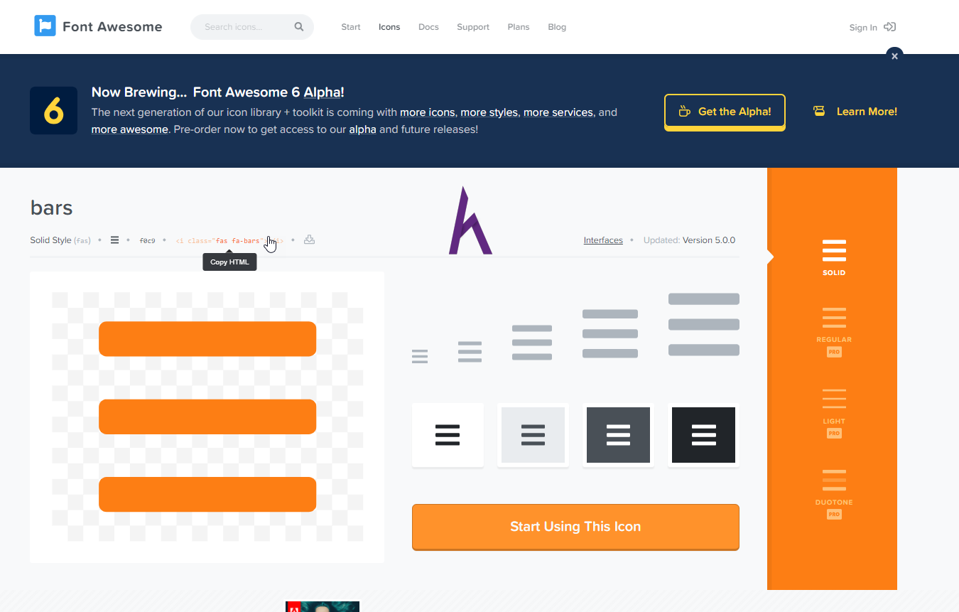
Truy cập Fontawesome.com > tìm bar và chọn mẫu bạn thích
Index.html
<!-- Chung ta dang code html -->
<!DOCTYPE html>
<html>
<head>
<title>Selftaught</title>
<link rel="stylesheet" href="https://use.fontawesome.com/releases/v5.4.1/css/all.css" integrity="sha384-5sAR7xN1Nv6T6+dT2mhtzEpVJvfS3NScPQTrOxhwjIuvcA67KV2R5Jz6kr4abQsz"
crossorigin="anonymous">
<link href="https://fonts.googleapis.com/css?family=Lato:300,400,700,900" rel="stylesheet">
<link rel="stylesheet" href="vendors/css/grid.css">
<link rel="stylesheet" type="text/css" href="resources/css/styles.css" />
<link rel="stylesheet" href="resources/css/queries.css">
</head>
<body>
<header id="home">
<nav >
<a href="#home"><img class="logo" src="./resources/img/logo.png" alt="logo"></a>
<ul class="main-nav">
<!-- unordered list -->
<li><a href="#testimonials">How Clients Think</a></li>
<!-- list item -->
<li><a href="#about">About</a></li>
<li><a href="#products">Products</a></li>
<li><a href="#contact">Contact</a></li>
</ul>
<i class="fas fa-bars mobile-nav-icon"></i>
</nav>
<div class="clearfix"></div>
<div class="row">
<div class="heading-main-box">
<h1>
We will study <br> English together.<br>
So join with us.
</h1>
<a href="#about" class="btn">Tell me more</a>
<a href="#products" class="btn">Join us</a>
</div>
</div>
</header>
<section class="about-section" id="about">
<div class="row">
<h2>About Us</h2>
<p class="p-long">
We are people that are studying English by ourselves, we believe that you don’t need to pay so much
money for being good at English, we’re here to help you
</p>
</div>
<div class="row">
<div class="col span-1-of-4 about-picture">
<img src="./resources/img/activities1.jpeg" alt="activities1">
<p class="picture-title">
Team Working
</p>
</div>
<div class="col span-1-of-4 about-picture">
<img src="./resources/img/activities2.jpeg" alt="activities2">
<p class="picture-title">
Funny class
</p>
</div>
<div class="col span-1-of-4 about-picture">
<img src="./resources/img/activities3.jpeg" alt="activities3">
<p class="picture-title">
Be confident
</p>
</div>
<div class="col span-1-of-4 about-picture">
<img src="./resources/img/activities4.jpeg" alt="activities4">
<p class="picture-title">
All our friends
</p>
</div>
</div>
</section>
<section class="products-section" id="products">
<h2>Products</h2>
<div class="row">
<div class="col span-1-of-3">
<div class="product-box">
<h3>Pronunciation class</h3>
<p class="product-price">19$ <span>/ month</span></p>
<ul>
<li><i class="fas fa-check small-icon"></i>Native voices</li>
<li><i class="fas fa-check small-icon"></i>Master IPA</li>
</ul>
<a href="#" class="btn">JOIN US</a>
</div>
</div>
<div class="col span-1-of-3">
<div class="product-box">
<h3>Speaking class</h3>
<p class="product-price">25$ <span>/ month</span></p>
<ul>
<li><i class="fas fa-check small-icon"></i>Native speaking</li>
<li><i class="fas fa-check small-icon"></i>Speaing naturally</li>
</ul>
<a href="#" class="btn">JOIN US</a>
</div>
</div>
<div class="col span-1-of-3">
<div class="product-box">
<h3>Listening class</h3>
<p class="product-price">25$ <span>/ month</span></p>
<ul>
<li><i class="fas fa-check small-icon"></i>Native speech</li>
<li><i class="fas fa-check small-icon"></i>Hearing English clearly</li>
</ul>
<a href="#" class="btn">JOIN US</a>
</div>
</div>
</div>
</section>
<section class="testimonials-section" id="testimonials">
<h2>Testimonials</h2>
<div class="row">
<div class="col span-1-of-3">
<blockquote>
The course is very helpful, I can speak English fluently and I think The SF English became my second family, I love everyone very much. Thank you!
<cite>
<img src="resources/img/person5.jpeg" alt="person1"> Nguyen Chem Gio
</cite>
</blockquote>
</div>
<div class="col span-1-of-3">
<blockquote>
I believe that who came to This English centre would love this place as I did, when the course finished, I feel sad because studying in that place I always felt funny.
<cite>
<img src="resources/img/person2.jpeg" alt="person1"> Tran Vo Van
</cite>
</blockquote>
</div>
<div class="col span-1-of-3">
<blockquote>
Trust me, you can master English just by joining this class, I did, so I believe that you can too. Hope that one day, you can come and join in this class.
<cite>
<img src="resources/img/person4.jpeg" alt="person1">Le Du Do
</cite>
</blockquote>
</div>
</div>
</section>
<section class="sponsors-section" id="sponsors">
<h2>Sponsors</h2>
<div class="row">
<ul class="sponsors-showcase clearfix">
<li>
<figure>
<img class="logo-sponsor" src="resources/img/barcelona_logo.png" alt="barcelona">
<figcaption>
Barcelona
</figcaption>
</figure>
</li>
<li>
<figure>
<img class="logo-sponsor" src="resources/img/mctcity_logo.png" alt="manchester city">
<figcaption>
Manchester City
</figcaption>
</figure>
</li>
<li>
<figure>
<img class="logo-sponsor" src="resources/img/tottenham_logo.png" alt="tottenham hotspur">
<figcaption>
Tottenham Hotspur
</figcaption>
</figure>
</li>
</ul>
<ul class="sponsors-showcase clearfix">
<li>
<figure>
<img class="logo-sponsor"src="resources/img/real_logo.png" alt="real marid">
<figcaption>
Real Marid
</figcaption>
</figure>
</li>
<li>
<figure>
<img class="logo-sponsor" src="resources/img/juventus_logo.png" alt="Juventus">
<figcaption>
Juventus
</figcaption>
</figure>
</li>
<li>
<figure>
<img class="logo-sponsor" src="resources/img/mctunited_logo.png" alt="manchester united">
<figcaption>
Manchester United
</figcaption>
</figure>
</li>
</ul>
</div>
</section>
<section class="contact-section" id="contact">
<div class="row">
<div class="col span-1-of-3">
<ul class="information">
<li><i class="fas fa-map-marker-alt small-icon"></i>Address: 21A, SelfTaught street, Ha Noi</li>
<li><i class="fas fa-envelope small-icon"></i>Email: selftaughtteam@edu.com</li>
<li><i class="fas fa-phone small-icon"></i>SĐT: (+084 )099-923-232-320</li>
</ul>
<ul class="social-icons">
<li><i class="fab fa-facebook"></i></li>
<li><i class="fab fa-twitter-square"></i></li>
<li><i class="fab fa-instagram"></i></li>
<li><i class="fab fa-google-plus-square"></i></li>
</ul>
</div>
<div class="col span-2-of-3">
<form>
<div class="row">
<div class="col span-1-of-3">
<label>Name</label>
</div>
<div class="col span-2-of-3">
<input type="text" placeholder="Your Name">
</div>
</div>
<div class="row">
<div class="col span-1-of-3">
<label>Email</label>
</div>
<div class="col span-2-of-3">
<input type="email" placeholder="Your Email">
</div>
</div>
<div class="row">
<div class="col span-1-of-3">
<label>Message</label>
</div>
<div class="col span-2-of-3">
<textarea placeholder="Your Message"></textarea>
</div>
</div>
<div class="row">
<input type="submit" class="btn" value="Send It">
</div>
</form>
</div>
</div>
</section>
<footer>
<p>
Copyright © 2018 by SELFTAUGHT TEAM
</p>
</footer>
<script
src="https://code.jquery.com/jquery-3.3.1.js"
integrity="sha256-2Kok7MbOyxpgUVvAk/HJ2jigOSYS2auK4Pfzbm7uH60="
crossorigin="anonymous"></script>
<script src="vendors/js/jquery.waypoints.min.js"></script>
<script src="resources/js/scripts.js"></script>
</body>
</html>
Style.css
/* ----------------------------- */
/* -----DEFAULT SETUP */
/* ------------------------------- */
 *{
    padding: 0px;
    margin: 0px;
    box-sizing: border-box;
}

html{
    font-family: 'Lato', sans-serif;
    font-size: 20px;
    color: #5a5a5a;
    background-color: #ffffff;
    text-rendering: optimizeLegibility;
    /* mac dinh la 16px */
}

body{
    overflow-x: hidden;
}

/* ------------------------------------ */
/* -----REUSABLE COMPONENT--------- */
/* ----------------------------------- */
.btn{
    text-decoration: none;
    color: white;
    background-color: #e67e22;
    padding: 15px 30px;
    border-radius: 20px;
    margin: 0 5px;
    width: 190px;
    display: inline-block;
    text-align: center;
    transition: all .3s;
}

.btn:hover,
.btn:active{
    background-color: #d35400;
}

.clearfix::after{
    content: " ";
    display: table;
    clear: both;
}

.row{
    max-width: 1140px;
    margin: 0 auto;
}

h1, h2, h3{
    text-transform: uppercase;
    letter-spacing: 1px;
}

h1{
    font-size: 300%;
    font-weight: 400;
    word-spacing: 5px;
    color: white;
    line-height: 135%;
    margin-bottom: 50px;
}

h2{
    color: #e67e22;
    font-size: 180%;
    font-weight: 700;
    text-align: center;
}

h2:after{
    content: " ";
    display: block;
    width: 150px;
    height: 3px;
    background-color: rgba(230, 126, 34,0.5);
    margin: 0 auto;
    margin-top: 5px;
}

h3{
    padding-top: 30px;
    padding-bottom: 10px;
    text-align: center;
    background-color: #265077;
    color: white;
    border-top-right-radius: 15px;
    border-top-left-radius: 15px;
    margin-bottom: 15px;
}

.p-long{
    text-align: center;
    color: #265077;
    font-size: 22px;
    margin-top: 40px;
    margin-bottom: 40px;
    width: 70%;
    margin-left: 15%;
    line-height: 140%;
}

section{
    padding: 50px;
}

.small-icon{
    color: #305679;
    font-size: 130%;
    margin-right: 10px;
}

/* -------------------------------------------- */
/* ------------------HEADER------------------ */
/* ------------------------------------------------ */
header{
    background-image: linear-gradient(45deg,rgba(2,33,64, 0.8) 55%,rgba(45,95,93,0.85)), url("../img/background4.jpeg");
    background-size: cover;
    background-
    height: 100vh;
    /* view height */
    background-attachment: fixed;
}

.logo{
    width: 350px;
    float: left;
    margin-left: 70px;
    margin-top: -50px;
    margin-bottom: -100px;
}

.main-nav{
    float: right;
    list-style: none;
    margin-right: 50px;
    margin-top: 55px;
}

.main-nav li{
    display: inline-block;
    margin-right: 30px;
}

.main-nav li a{
    text-decoration: none;
    color: white;
    font-size: 110%;
    font-weight: 700;
    transition: border-bottom 0.5s;
    padding: 3px 0;
}

.main-nav li a:hover,
.main-nav li a:active{
    border-bottom: 2px solid #cccccc;
}


.heading-main-box{

    top: 50%;
    left: 50%;
    transform: translate(-45%, -55%);
    width: 1140px;
}

/* ------sticky----- */
.sticky{
    background-color: rgba(2,33,64,.9);

    top: 0;
    left: 0;

    width: 100%;
    padding-bottom: 10px;
}

.sticky .logo{
    width: 250px;
    margin-top: -40px;
    margin-bottom: -70px;
}
.sticky .main-nav{
    margin-top: 30px;
}

/* ----mobile navigation icon----- */
.mobile-nav-icon{
    font-size: 200%;
    color: #6b95bd;

    top: 55px;
    right: 100px;
    display: none;
}

.sticky .mobile-nav-icon{
    top: 30px;
}

/* ---------------------------- */
/* ---------ABOUT SECTION--------- */
/* ------------------------------------- */
.about-picture{

    margin-top: 50px;
}
.about-picture img{
    width: 90%;
    border-radius: 20px;
    border: 4px solid #c2e1fd;
    box-shadow: 0px 5px 15px 5px #265077 ;
    transition: all .7;
    /* x-y-độ mờ-đọ phóng rộng-màu */
    /* filter: brightness(55%) blur(2px); */
}

.picture-title{

    top: 50%;
    left: 50%;
    color: #c2e1fd;
    transform: translate(-65%,100%);
    opacity: 0;
    transition: all .7s;
}

.about-picture:hover img,
.about-picture:active img{
    filter: brightness(55%) blur(2px);
}

.about-picture:hover .picture-title,
.about-picture:active .picture-title{
    transform: translate(-65%, -50%);
    opacity: 1;
}

/* ------------------------- */
/* -----PRODUCT-SECTIOn-------- */
/* ----------------------------- */
.products-section{
    background-color: #f4f4f4;
}

.products-section h2{
    margin-bottom: 60px;
}

.product-box{
    background-color: #eeefff;
    box-shadow: 3px 5px 10px #e0e0e0;
    width: 90%;
    height: 350px;
}

.product-price{
    color: #265077;
    font-size: 250%;
    font-weight: 300;
    text-align: center;
}

.product-price span {
    font-size: 80%;
}

.product-box ul li{
    margin-left: 20%;
    list-style: none;
    margin-top: 20px;
    margin-bottom: 20px;
}

.product-box .btn{
    margin-left: 20%;
}

/* ------------------------------- */
/* ---------TESTIMONIALS SECTION ---------- */
/* ------------------------------------------ */
.testimonials-section{
    background-image:linear-gradient(45deg,rgba(2,33,64, 0.8) 55%,rgba(45,95,93,0.85)), url('../img/background2.jpeg');
    background-
    background-size: cover;
    background-attachment: fixed;
}

.testimonials-section h2{
    margin-bottom: 70px;
}

blockquote{
    width: 95%;

    font-style: italic;
    line-height: 140%;
    color: white;
}

blockquote:before{
    content: '\201C';
    display: block;
    font-size: 400%;

    top: -10px;
    left: -10px;
}

cite{
    display: block;
    color: #6b95bd;
    margin-top: 25px;
}

cite img{
    height: 50px;
    border-radius: 50%;
    border: 2px solid #265077;
    vertical-align: middle;
    margin-right: 5px;
}
/* ----------------------------------- */
/* --------SPONSOR SECTION-------- */
/* ------------------------------------ */
.sponsors-section{
     background-color: #f4f4f4;
}

.sponsors-section h2{
       margin-bottom: 50px;
}

.sponsors-showcase{
    margin-left: 8%;
}

.sponsors-showcase li{
    list-style: none;
    float: left;
    width: 30%;
    text-align: center;
    margin-bottom: 20px;
}

.logo-sponsor{
    width: 140px;
    cursor: pointer;
    transition: all .3s;
}

.sponsors-showcase li .logo-sponsor:hover,
.sponsors-showcase li .logo-sponsor:active{
    transform: scale(1.2);
}

figcaption{
    color: #265077;
    font-weight: 900;
    font-size: 120%;
    cursor: pointer;
}
/* ---------------------------------- */
/* ----------CONTACT FORM------------- */
/* ------------------------------------------- */
.contact-section{
    background-image: linear-gradient(45deg,rgba(2,33,64, 0.8) 55%,rgba(45,95,93,0.85)),url('../img/background5.jpeg');
    background-
    background-size: cover;
    background-attachment: fixed;
}

/* ------------------------------------- */
/* ---------FOOTER------------------- */
/* ---------------------------------- */
footer{
    text-align: center;
    background-color: #494949;
    color: white;
    padding: 20px;
}

.information{
    list-style: none;
    color: white;
    line-height: 200%;
    margin-top: 70px;
    word-spacing: 1px;
    font-size: 95%;
}

.information .small-icon{
    color: #427db4
}

.information .small-icon:hover,
.information .small-icon:active{
    transform: scale(1.3);
}

.social-icons{
    margin-top: 50px;
    list-style: none;
}

.social-icons li{
    display: inline-block;
    font-size: 250%;
    margin-left: 20px;
    color: white;
}

.social-icons li i{
    transition: all .3s;
    cursor: pointer;
}

.social-icons li i:hover,
.social-icons li i:active{
    transform: scale(1.3);
    color: #e67e22;
}

/* -------form----------- */
form{
    background-color: rgba(0, 0, 0, .4);
    margin-left: 40%;
    width: 68%;
    padding: 30px;
    margin-bottom: 30px;
}

form .row{
    margin-bottom: 20px;
}

label{
    font-size: 150%;
    color: white;
}

input, textarea{
    outline: none;
    padding: 10px;
    background-color: rgba(48, 47, 47, 0.3);
    border: 1px solid rgba(70, 68, 68, 0.7);
    margin-left: 30px;
    cursor: pointer;
    border-radius: 5px;
}

textarea{
    resize: none;
    height: 100px;
}

input{
    height: 50px;
}

input[type=text], input[type=email], textarea{
    width: 80%;
    font-size: 100%;
    transition: all .3s;
}

input[type=text]:focus, input[type=email]:focus, textarea:focus{
    color: white;
    background-color: rgba(48, 47, 47, 0.8)
}

form .row:last-child{
    text-align: center;
}

input[type=submit]{
    font-weight: 700;
    font-size: 100%;
    border-radius: 5px;
    width: 60%;
}
Queries.css
/* Big tablet to 1200px; */
@media only screen  and (max-width:1200px){
   html{
       font-size: 16px;
   }
   .heading-main-box{
       transform: translate( -35%,-50%)
   }

   form{
       margin-left: 30%;
   }
}

/* Small tablet to big tablet from 768x to 1023px */
@media only screen and (max-width:1023px){
    .logo{
        width: 300px;
        margin-left: 40px;
    }
    .main-nav{
        margin-top: 40px;
       margin-right: 15px;
    }
    .main-nav li{
        margin-right: 10px;
    }

    .heading-main-box{
        transform: translate(-20%,-50%)
    }

    .products-section .btn{
        width: 80%;
        margin-left: 10%;
    }

    .product-box{
        width: 95%;
    }

    h3{
        font-size: 90%;
    }

    .product-box ul li{
        margin-left: 5%;
    }

    .product-box .small-icon{
        margin-right: 5px;
    }

    .social-icons li{
        margin-left: 10px;
    }

    .information i{
        display: block;
    }

    .information li{
        font-size: 14px;
    }
}

/* Small phones to small tablets */
@media only screen and (max-width: 767px){
  .col{
      width: 100%;
  }
  .main-nav{
      display: none;
  }

  .mobile-nav-icon{
      display: block;
  }
  .logo{
      width: 350px;
      margin-left: 12%;
  }
  h1{
      word-spacing: 2px;
      font-size: 250%;
  }
  .heading-main-box{
      transform: translate(-17%,-50%);
  }
  .heading-main-box .btn{
      width: 15%;
  }

  .about-section .row .p-long{
      font-size: 20px;
  }

  .about-picture{
      text-align: center;
  }
  .about-picture img{
      width: 70%
  }
  .picture-title{
      font-size: 25px;
  }
  .product-box{
      width: 70%;
      margin-left: 20%;
  }
  .product-box ul li {
      margin-left: 25%;
  }

  .testimonials-section .row .col{
      margin-bottom: 50px;
  }

  figcaption{
      visibility: hidden;
  }

  form{
      width: 80%;
      margin-left: 10%;
  }
  label{
      margin-left:35%;
  }
  .information{
      margin-top: 20px;
      text-align: center;
  }
  .information li{
    font-size: 20px;
  }
  .social-icons{
      text-align: center;
  }
  .social-icons li {
      font-size: 60px;
      margin-bottom: 20px;
  }
}

@media only screen and (max-width: 570px){
    .mobile-nav-icon{
        right: 45px;
    }
}

/* Small phones from 0 to 480px; */
@media only screen and (max-width: 480px){
   html{
       font-size: 12px;
   }

   h1{
       font-size: 200%;

   }

   .logo{
       width: 220px;
       margin-top: 10%;
       margin-left: 20%;
   }

   .heading-main-box{
    transform: translate(-10%, -50%);
   }

   .heading-main-box .btn{
       width: 13%;
   }

    .heading-main-box .btn{
          display: block;
          margin-bottom: 20px;
          margin-left: 2%;
    }


    .information li{
        font-size: 16px;
    }

    .social-icons li{
        font-size: 40px;
    }

    form{
        width: 90%;
        margin-left: 5%;
    }

    .mobile-nav-icon{
        top: 100px;

    }

    .sticky .logo{
        width: 200px;
        margin-top: -25px;
    }
}
Scripts.js
$(document).ready(
    function(){

        // sticky nav
        $('.about-section').waypoint(
            function(direction){
                if(direction == "down"){
                    $('nav').addClass('sticky');
                }else {
                    $('nav').removeClass('sticky');
                }
            },{
                offset: '600px'
            }
        )

        // Scroll
        $('a').click(function(event){
            $('html, body').animate({
                scrollTop: $( $.attr(this, 'href') ).offset().top
            }, 700);
            event.preventDefault();
        });

        // mobile navigation
        $('.mobile-nav-icon').click(
            function(){
                $('.main-nav').slideToggle(200);

                if($('.mobile-nav-icon').hasClass('fa-bars')){
                    $('.mobile-nav-icon').addClass('fa-times');
                    $('.mobile-nav-icon').removeClass('fa-bars')
                }
                else{
                    $('.mobile-nav-icon').addClass('fa-bars');
                    $('.mobile-nav-icon').removeClass('fa-times')
                }
            }
        )
    }
)
Kết luận
Trong bài học này chúng ta đã hoàn thiện phần mobile navigation, cũng như hoàn thiện website của chúng ta
Ở bài học sau Kteam sẽ hướng dẫn bạn cách TỐI ƯU HÓA WEBSITE
Cảm ơn các bạn đã theo dõi bài viết. Hãy để lại bình luận và góp ý của mình để giúp phát triển bài viết tốt hơn. Đừng quên: "Luyện tập – Thử thách – Không ngại khó".
Tải xuống
Tài liệu
Nhằm phục vụ mục đích học tập Offline của cộng đồng, Kteam hỗ trợ tính năng lưu trữ nội dung bài học Code Mobile navigation dưới dạng file PDF trong link bên dưới.
Ngoài ra, bạn cũng có thể tìm thấy các tài liệu được đóng góp từ cộng đồng ở mục TÀI LIỆU trên thư viện Howkteam.com
Đừng quên like và share để ủng hộ Kteam và tác giả nhé!

Project
Nếu việc thực hành theo hướng dẫn không diễn ra suôn sẻ như mong muốn. Bạn cũng có thể tải xuống PROJECT THAM KHẢO ở link bên dưới!

Thảo luận
Nếu bạn có bất kỳ khó khăn hay thắc mắc gì về khóa học, đừng ngần ngại đặt câu hỏi trong phần bên dưới hoặc trong mục HỎI & ĐÁP trên thư viện Howkteam.com để nhận được sự hỗ trợ từ cộng đồng.


Nội dung bài viết
Tác giả/Dịch giả
Khóa học
Lập trình Front End cơ bản với website Landing Page

Nếu bạn yêu thích lập trình web nhưng còn lơ ngơ không biết bắt đầu từ đâu hay đã biết cơ bản mà chưa làm được một sản phẩm nhất định nào, thì đây chính là khóa học dành cho bạn – LẬP TRÌNH FRONT END CƠ BẢN VỚI WEBSITE LANDING PAGE.
Trong phần này, Kteam sẽ giới thiệu cho các bạn về nội dung chúng ta sẽ được hướng dẫn cho khóa học này, cũng như là project mà chúng ta sẽ cùng nhau thực hiện.
Nào! Bắt đầu thôi!
Ad hướng dẫn em code đoạn click vô mobile-nav-icon để chuyển đổi qua lại giữa fa-bars và fa-times với...em code mà click vô nó không đổi...em code theo code của ad dẫn rồi ạ:
$('.mobile-nav-icon').click(
function(){
$('.main-nav').slideToggle(200);
//của main-nav
if ($('.mobile-nav-icon').hasClass(fa-bars)){
$('.mobile-nav-icon').addClass(fa-times);
$('.mobile-nav-icon').removeClass(fa-bars);
}
else{
$('.mobile-nav-icon').removeClass(fa-times);
$('.mobile-nav-icon').addClass(fa-bars);
}
}
)